It’s surprising how many homes are built for families but feature bathrooms that only accommodate one person at a time. This is especially important for master baths, where husbands and wives may share the space as they get ready for their days. As the clock ticks towards rush hour and spouses compete for sink or shower time, tensions can run high. That’s not what a bathroom is for at all. Bathrooms should be spaces where you can relax, unwind and gently ease into or out of your day. In this round up of dramatic before and after bathroom remodels, we’ve highlighted redesigns that created couple-friendly spaces with an updated style and sensibility.
Before & After Bathroom #1 – Can’t believe its a bathroom
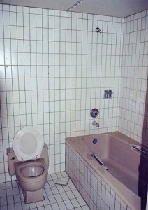
No, this isn’t a cover for a grunge album from the 1990s. This is an actual bathroom. Fortunately, it’s a before shot. The unpleasant aspects of this bathroom hardly need unpacking. The uniform tile gives it an institutional feel while years of grime make it seem like a gas station restroom with an inexplicable bathtub rather than someone’s actual bathroom at home. The incessant grid pattern wearies the eye while the bath tub fixtures seem like after thoughts. Let’s not get into what’s going on with the toilet.
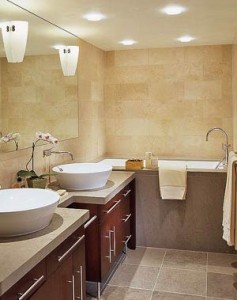
And then there was light! This is actually the same bathroom. We’re not joking, go check out KitchenBathIdeas (where we got this and the next photo set) for proof. Two sinks are added with some dark, wood cabinetry. Lighting in the ceiling and the sconces against the expansive mirror are a welcome reprieve from the soul crushing tile. The bath tub has been replaced with a clean, high end tub. Overall, this looks like a bathroom that you could definitely live with. Homey with a touch of class.
For a similar vanity check out the Decolav 5700 Bathroom Vanity
For a similar round above counter basin check out the Porcher Como Above Counter Bathroom Basin
Before & After Bathroom #2 – There’s so much room
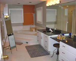
This bathroom, in it’s own right, is an admirable start at a master bath. Ample room for primping and grooming and a relaxing tub in the corner. But there’s still much potential to be tapped. Aside from the obviously unfinished aspects in the corner, there are some missed opportunities in the bathroom vanity area as well. The entire space would be served well by some brightness and color as well.
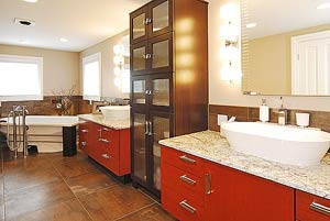
The salon-esque stool is replaced by a gorgeous bathroom cabinet for linens, towels and other sundries, which helps cut down on clutter. Over in the corner, you’ll see that the tub has been replaced by a proper jetted bath–likely a whirlpool or air tub. The windows have been finished with an earthy stone trim. White granite countertops introduce class that matches the elegance of the furniture style storage and the red-toned cabinet doors are bright, yet tasteful. Basin sinks flank the storage area for a sensible his and hers vanity that allows both partners to get ready at once.
For a similar oval bathroom basin check out the Hastings Oval Above Counter Basin
Before & After Bathroom #3 – Not so bad after all
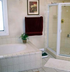
This remodel done by Pacific Interior Design Group was made to address some of the client’s specific concerns. Namely, the bathroom was too small for a couple and the white tile gave the space a cold and sterile feel. They also wanted a Jacuzzi tub for relaxation and hydrotherapy.
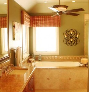
The designers added warmth through color, candles and stone countertops. The natural light is inflected with a more inviting quality by adding window treatments. Not pictured here is a dual shower head shower, for those rush-rush-rush mornings where both partners want to hop in at the same time. And when they aren’t in a hurry, they can relax in their brand new whirlpool Jacuzzi tub and melt away the stress from a fast-paced lifestyle.
Before & After Bathroom #4 – And from the darkness
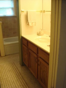
Here’s a DIY bathroom renovation for a OneProjectCloser contest that really worked! This cramped bathroom wasn’t doing any favors for marital bliss nor aesthetic pleasantries. The sink and bath tub combo looked outdated at best and dingy at worst. The couple decided to take matters into their own hands to get it updated, coordinated and functional.
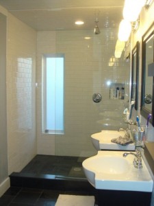
First order of business: dual sinks. Two sinks, two bathroom vanities, no more elbows at the sink while getting ready in the morning. The room was gutted and the layout was opened up and given a clean, modern black and white motif. The bathroom lighting and shower lighting is free to play over the entire room without casting ugly shadows, while the narrow window lets in natural light while still offering privacy. Overall, a great redesign that’s couple-friendly and pleasing to the eye.
For a similar vanity check out the Empire Contempo Bathroom Vanity
Before & After Bathroom #5 – The mighty jungle
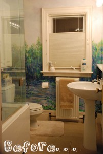
How you feel about what this couple did with their bathroom (via ApartmentTherapy) depends on your philosophies on art and where it belongs. Monet fans might enjoy a nice impressionistic landscape while mulling over their business, but purists might balk at the crass representation. Fine art, they might argue, belongs in a museum, not tucked behind the radiator and covered in a thin film of mildew. At any rate, the new tenants harbored principles that drove them to simplify the look and feel of the bathroom and make it a little more modern and conventional.
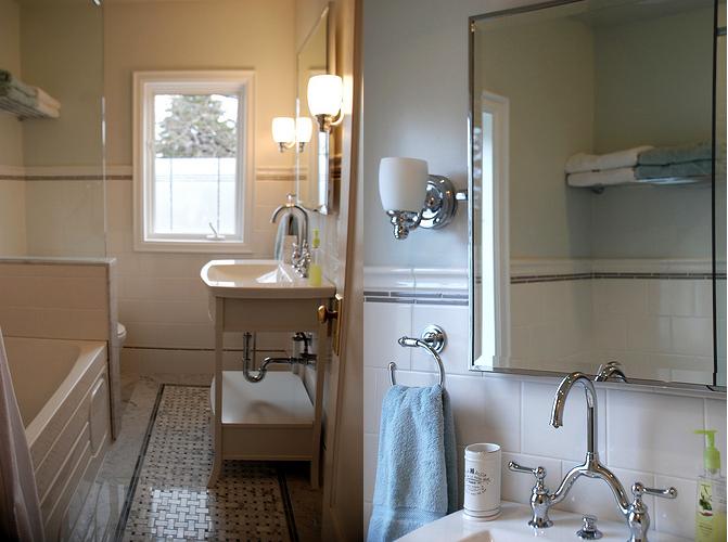
The new bathroom vanity is modern, functional and stylish, and in our opinion, has character, too. The Monet is replaced by a tile with an accented line and tasteful polished bathroom accessories. While the previous design was undoubtedly pleasing to one person’s quirky tastes, this remodel is a more measured crowd pleaser. Guests in this bathroom will be far more likely to emerge with compliments rather than questions.

Nice use of stone in the bathroom. Compliments the scene very well.