If you’re a true lover of symmetry, of mirror images and uniformity… this post may just influence you to open your mind to asymmetrical balance.
No, asymmetrical doesn’t have to mean crooked, unbalanced, or annoyingly “off.” On the contrary: asymmetrical decorating can be trickier to get just right than straightforward, equal symmetry. If you don’t get the asymmetrical balance right, then it will indeed look askew.
When executed properly, asymmetrical decor isn’t just not lopsided, it’s satisfyingly balanced.
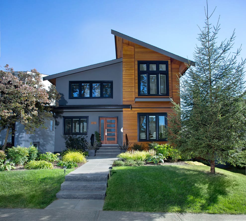
An asymmetrical space is more relaxed and dynamic than a straitlaced, formal symmetrical space. Like symmetry, asymmetry is based on a central axis; however, in a symmetrical space, each side of the line is identical, while in an asymmetrical design, the room is balanced with features or furnishings of equal visual weight – rather than identical pieces – on either side.
Asymmetry is trendy now, as evidence by asymmetrical necklines and hemlines in current clothing styles. So it’s important that you learn to get it right!
An asymmetrical design is artful and striking, with added character that’s not found in symmetry.
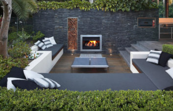
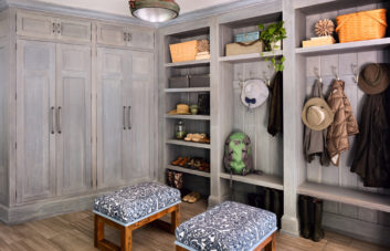
Include elements – color or shape – from the opposite side of the “line” for balance:

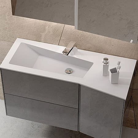
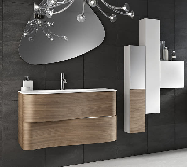
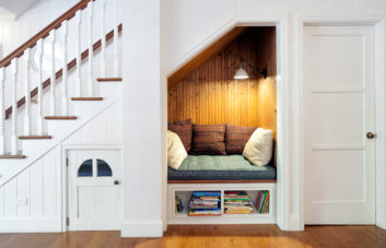
Liven a symmetrical room with an asymmetrical light fixture or other feature:


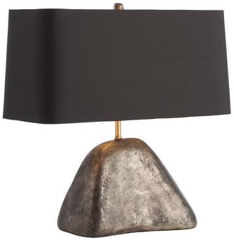
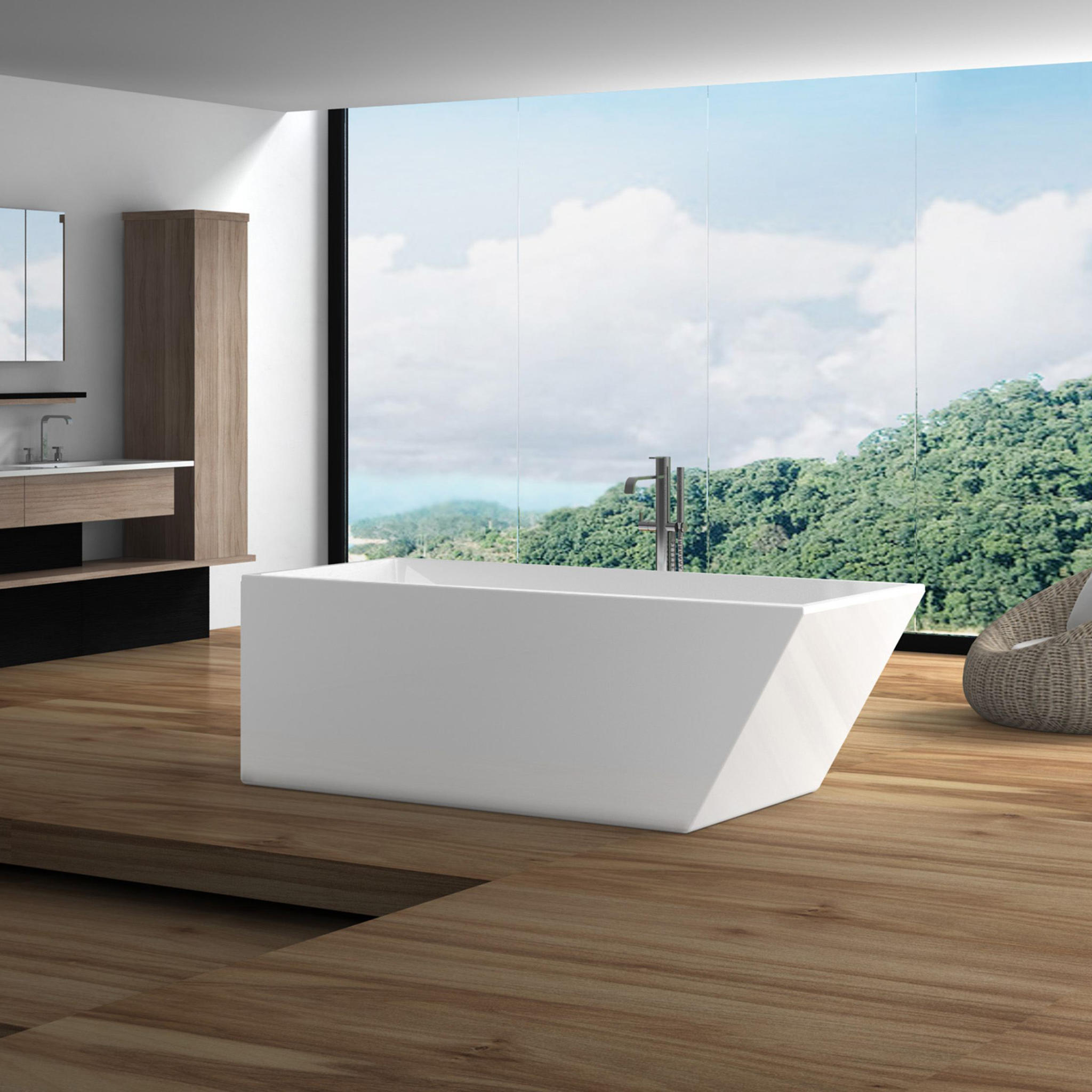
But mainly, the key to perfect asymmetry is to rely on your innate sense of balance to tell you when it’s right. (If your innate sense of balance could use some fine-tuning, call in another opinion – or a professional.)


Which camp are you in? Symmetry or asymmetry?

1 thought on “Perfectly Irregular: Asymmetrical Balance in Home Design”
Comments are closed.