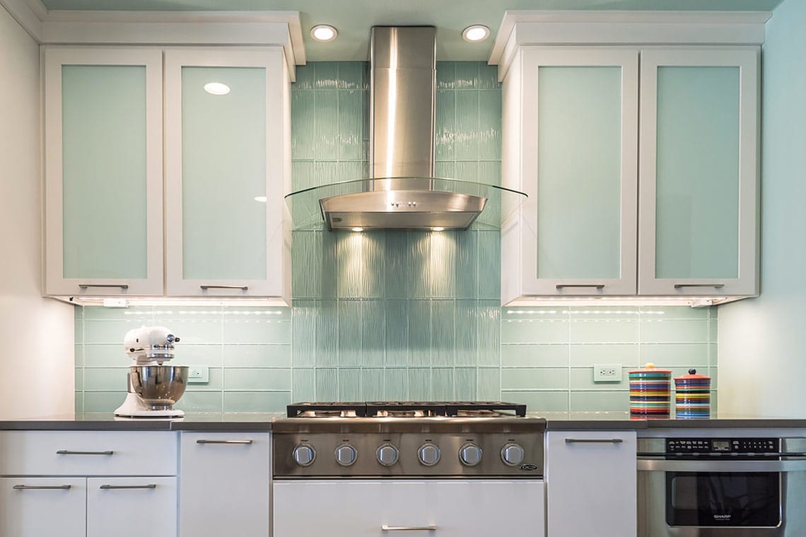
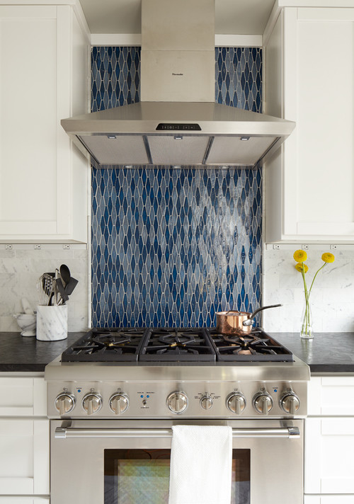
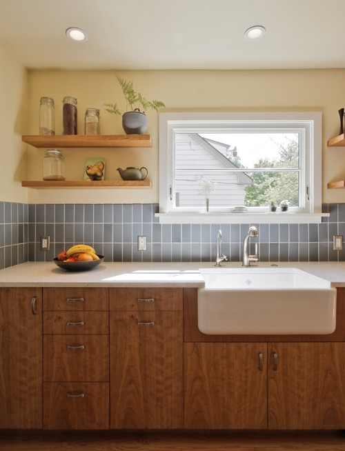
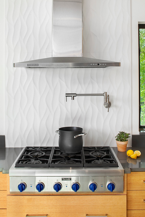
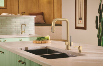
The kitchen is just about done; fixtures, cabinetry, plumbing, even accessories. Now that it’s all installed, it’s time for the finishing touches, the most noticeable – and potentially statement-making – of which is the backsplash. Assuming you’ve found a tile that complements the kitchen, satisfies your taste, and isn’t way out of budget (yes, easier said than done), you now have to make one last decision: the installation pattern.
Herringbone and chevron may be too trendy (and chevron incurs a lot of waste); standard bricked or stacked patterns are just too, well, standard. Try this: a vertical tile backsplash.
It’s simple; just take that tile – standard subway, mosaic, large-format, or any other style – and turn it “the long way” instead of the typical horizontal layout. You may be surprised to discover that it looks entirely different, without losing any of the tile details.
Three great reasons to should turn your backsplash on its side:
- It gives an illusion of height; adding vertical stripes to any surface can make it look taller, which is perfect for spaces with upper cabinets.
- It’s different, but not too different, for those who like to play it safe while exploring their creativity. For a fresh twist on a modern classic, try laying subway tile vertically or turn a textured or 3D tile sideways.
- Depending on the size and shape of the tile and the backsplash, it can be more cost-effective with less waste.
Tell us about your backsplash tile!

