 In the dog-eat-dog design world that is New York City, sticking out amongst your peers is no easy task. Yet, designer Clare Donohue has managed to gain a steady following of admirers along with an entirely satisfied clientele. By combining contemporary with traditional, Donohue’s designs are both functional and eye-catching.
Rarely does an interior designer cover so many different types of design renovations as Donohue does — evidenced by the fact that Donohue’s company, 121 Studio, has been featured in a plethora of magazines ranging from House Beautiful to Child Magazine. Donohue has designed spaces ranging from a child’s bathroom to a kitchen built for serious cooks, and it seems unlikely that this designer will meet a space that she can’t conquer.
While it’s clear that Donohue’s designs are stunning and innovative, there’s another reason why this designer is able to bridge design gaps that others in her field only dream of. All of Donohue’s visions merge practicality with perfect form in order to create spaces that are entirely liveable. Donohue isn’t afraid to mix design styles, and that might be the reason why her designs are causing many people within the design world to study her work closely.
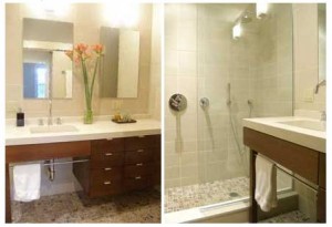
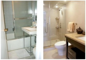
All of Donohue’s interiors are worth looking at, though her bathroom interiors tend to stand out from the pack. Of note are a couple of different bathroom interiors including one simply serene Brooklyn Brownstone. This bathroom space has clean lines, subtle metallic touches, a contemporary bathroom vanity, and an ingenious glass shower door that creates fluid movement. By keeping this space clean, Donohue has allowed the eye to imagine a bathroom that’s double the size of the actual space.
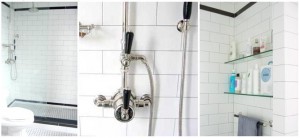
Another bathroom space that shows Donohue’s ingenuity brings together old and new. This bathroom is located inside of a prewar apartment that happens to be home to an owner who prefers all things modern. Without compromising the prewar style of the bathroom, Donohue encouraged the age-old feel by adding modern shower fixtures that have an antique quality to them. It’s clear from this renovation that when it comes to mixing modern with classic, Donohue’s designs are pure genius.
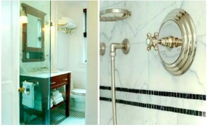
A different recently renovated prewar home got a major facelift when Donohue was hired to clean the space up, but visitors to this bathroom would be hard-pressed to tell that the space is entirely contemporary. When put to the task of creating a bathroom that felt as old as the home it was in, Donohue juxtaposed modern elements with classic fixtures in order to create a room that feels as ancient as the rest of the home, without being limited by prewar hardware. The result is a brilliant contemporary space masquerading as an antebellum bathroom.
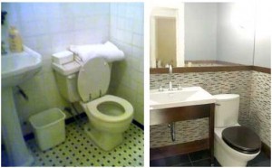
Even though Donohue has designed more than her fair share of spacious bathrooms, designs such as this one prove that you don’t have to have an expansive budget or a never-ending space in order to create an appealing design. Here, an ordinary powder room is transformed into a room that seems to have a lot of extra footage. By adding a large mirror, rethinking the shape of a standard toilet, decorating the walls with some colorful new tiles, and using a bathroom console instead of a vanity this small powder room is now every bit as intriguing as any sprawling space.
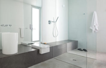
If Clare Donohue’s designs can teach renovators and designers one thing, it is to look at a space through practical eyes without compromising fine design. It’s entirely possible to design a bathroom that feels very old, but is comprised of entirely modern elements. It’s also possible to expand the size of a bathroom by eliminating doors and adding sleek steel fixtures.
Donohue’s bathroom designs are a pure reflection of a designer who understands that contemporary design doesn’t have to mean design that is out of place. While it’s easy to ruin a space by adding modern fixtures to an older home, she has shown that it is just as easy to perfectly blend contemporary with traditional. By taking a page from Donohue’s book and considering both classic and contemporary, any bathroom space can be entirely transformed.
The trick, it seems, is to think of a space as a functional place by adding design that works within the space itself. When attempting to renovate a bathroom (or any room), choosing design elements that will work with a particular lifestyle is crucial. Clare Donohue’s designs embody timelessness, sensibleness, and perfectly executed lines. It’s safe to say that Donohue’s work is causing New York City’s bustling design world to pause, reflect, and make note of her many design talents.
Bio:
I’m an independent interior designer with clients primarily in Manhattan, Brooklyn, and Westchester. Since 1996, I have been designing and overseeing the renovation of kitchens, baths, and whole apartments. I also consult on paint color palettes, furnishings and finishing touches.
This is a personalized service, not a showroom or a volume business. My collaboration with a client is truly “one to one.” Design services are offered via a one-time consultation or an ongoing relationship. Read more on linkedin.com
Clare’s blog – brickunderground.com
Clare’s web site – 121studio.com

Very nice. I like the preservation of the old style with the incorporation of the modern feel.
Great Article!
I’ve long been a fan of mixing traditional and contemporary design elements for my own space. I’m definitely going to start following Clair’s work.
Nice article. Amazing what can be done with a small space when an outsider takes an un-biased look at creating the illusion of a larger space. It really becomes just that – a larger space in one of the most important rooms of a home. Kudos to Claire.
Although it my be the picture angle, the prewar bath after shot looks very crowded – if fact, there can’t be the required 15″ minimum distance required between the center of the toilet and the vanity. Don’t get me wrong, the new look is a vast improvement – it just looks like a blatant code violation.
Great article. The pictures will really make anyone think of doing a bathroom remodeling.
Great to see the work of a gifted designer. So many so-called designs are ‘off the shelf’. The ability to mix traditional and contemporary styles is harder than it looks, it needs a good eye for both form and function. Very helpful article.
Great designs! Contemporary look meets modern elements. I think these look never go outdated.
Any designer can make something wonderful in a large space, its what they can do with a small space I believe that allows you to judge how good they really are. From what I see Claire looks pretty good.
Great Work! I agree with Joe above…it’s the small space that makes or breaks a room.
Love the subway tile bathroom. Light grey grout is nice in how it helps define the shape of the tiles. Hello from Del Mar, CA!