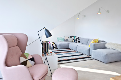
…wait. Isn’t pink is a spring color?
Pantone begs to differ. Cashmere Rose, a rich, muted, upscale, sophisticated pink, is one of the most popular colors of their 2015 Fall Fashion Color Report, and for good reason. Rose is a chic, elegant shade of pink that’s both beautiful and versatile.
Rose pairs perfectly with neutrals, darker, moodier shades, and other pastels. It’s typically an accent color, though it’s soft enough to be used as a wall color in virtually every room.
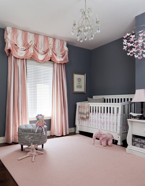
This pink is not just for little girls by any stretch, though it’s obviously appropriate in girls’ rooms and nurseries:
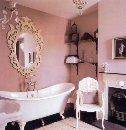
It’s soothingly tranquil for a bathroom (and NOT reminiscent of the hideously 80s-style dusty rose tiles, thankyouverymuch):
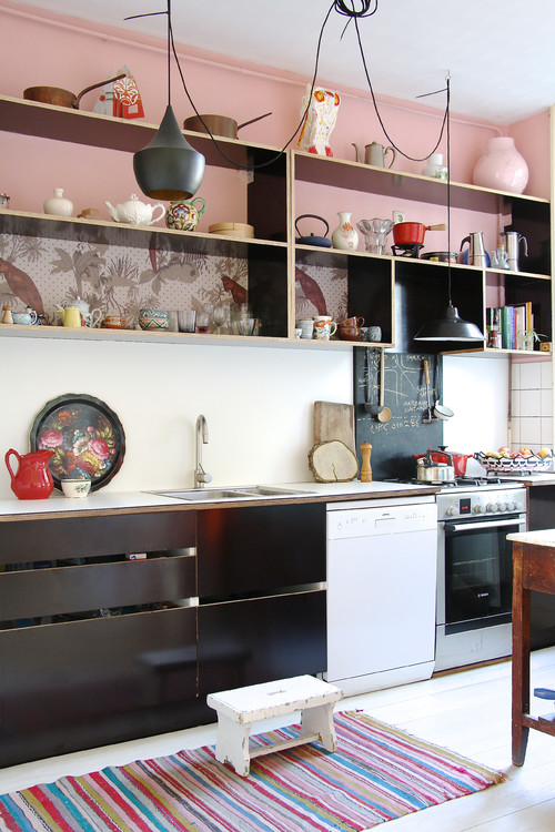
Though pink is not your typical kitchen color, it is technically a shade of red, so the warm-color kitchen rule applies – it’s an appetite stimulant, warm, and inviting. What more could you want from a kitchen color palette?

(What an array of styles! This pink works with contemporary, modern, traditional, transitional, and even rustic schemes.)
Rose is a comforting and relaxing shade, so incorporating it into a living room is an excellent idea:
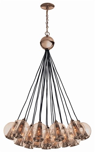
See the entire collection here.
Does that change your outlook on pink? What’s your favorite unexpected fall color?

