Every year, Pantone – color masters extraordinaire – unveils a color of the year. While other color experts (Benjamin Moore and Sherwin Williams, among others) also name a color of the year, Pantone’s is the gold standard. So the Pantone Color of the Year 2016 is…
…two colors?
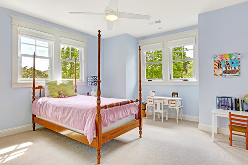
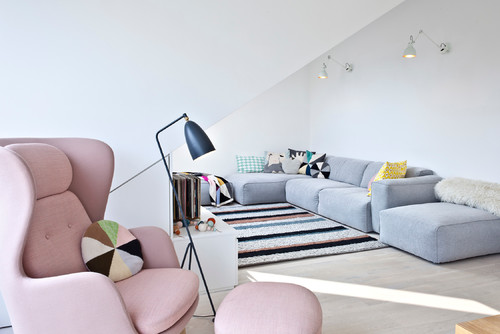
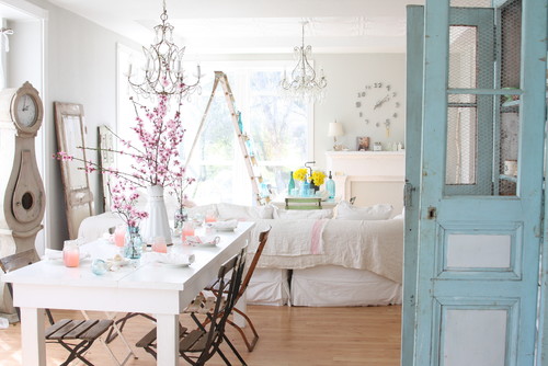
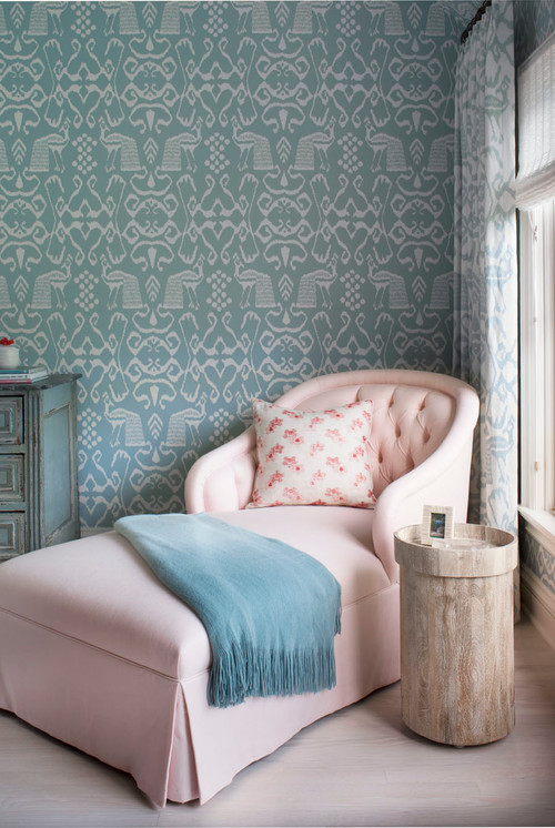
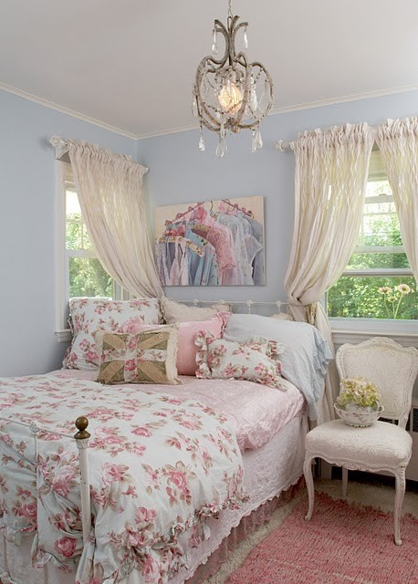
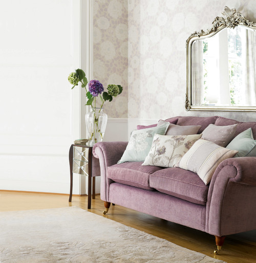
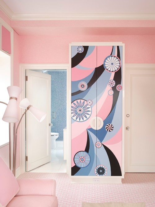
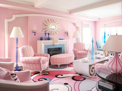
That’s right, two colors. For the first time, Pantone has chosen two shades: Rose Quartz, a nude rose (duh) tone, and Serenity, a soothing blue in the periwinkle family.
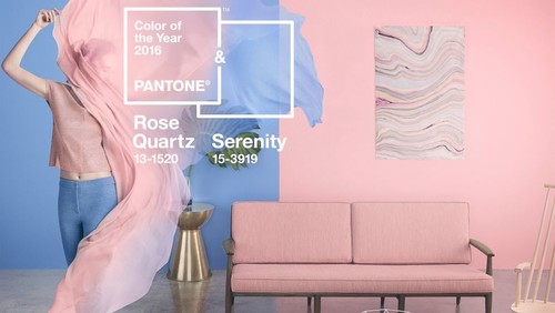
So what makes this year different? It’s not that the powers-that-be at Pantone couldn’t make up their minds (anyone else picturing a Sleeping Beauty-esque “Pink! Blue!” meeting?) – the dual choices represent the “gender blur” that society is currently experiencing.
Because pink and blue are generally exclusive (at least in kids’ rooms), the blending of the shades has a refreshingly lovely and tranquil effect. Both colors are softer than more recent years’ Colors, “reflecting connection and wellness as well as a soothing sense of order and peace,” according to Pantone.
For the first time Pantone introduces two shades, Rose Quartz and Serenity as the PANTONE Color of the Year 2016. Rose Quartz is a persuasive yet gentle tone that conveys compassion and a sense of composure. Serenity is weightless and airy, like the expanse of the blue sky above us, bringing feelings of respite and relaxation even in turbulent times.
The combination is reminiscent of the colors painted across the skies at dawn and dusk; natural, peaceful, inspirational.