Ask any homeowner to describe their dream kitchen. Chances are you’ll get wildly varied answers, but there’s one recurring element that most people want: an open, airy feel. Who wants a dark, closed-in kitchen? You’d be hard-pressed to find a cramped-kitchen enthusiast. Hence, the steady disappearance of upper cabinets in new kitchen designs.
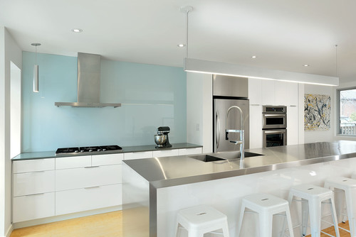
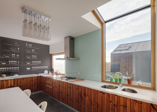
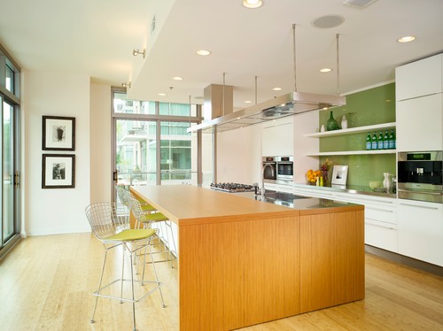
Many are sacrificing extra storage space for a more open kitchen, either swapping uppers for open shelves or doing away with them entirely. This trend has led to another, more design-oriented one: the full-wall backsplash.
The four-inch backsplash crafted of countertop material is a thing of the past (and it was never all that practical to begin with – who confines their cooking messes to the lower four inches?). Kitchens today feature backsplashes that cover the entire space between counter and upper cabinet. Now that those cabinets are starting to fade out, backsplashes can continue uninterrupted until the ceiling.
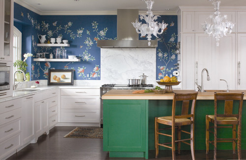
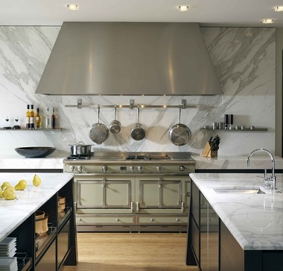
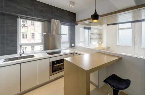
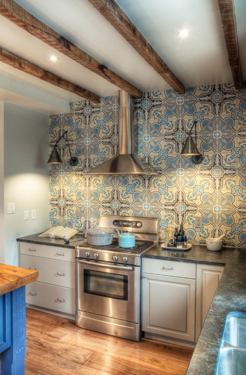
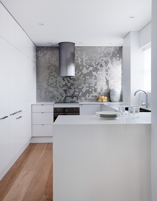
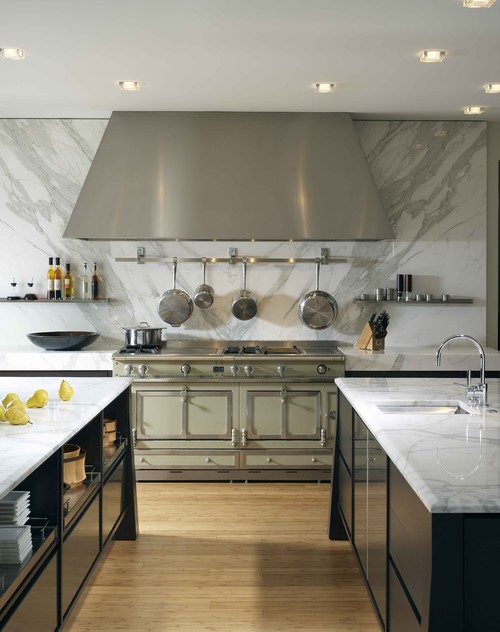
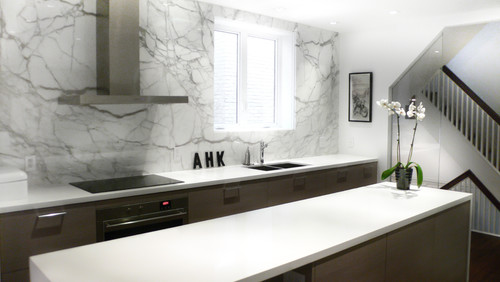
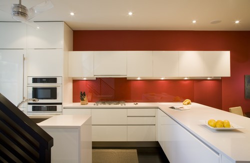
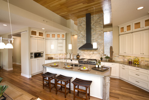
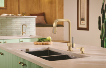
As you can see, it works with backsplash materials of all kinds – mosaic tile, large-format tile, wallpaper, back-painted glass. But the effect is particularly striking with a slab backsplash:
Now, it may be beautiful, but the full-wall backsplash isn’t for everyone. For starters, lots of kitchens simply can’t sacrifice that cabinetry, and even the shorter backsplashes are tough on one’s wallet. To get a similar effect with more space and for less cash, continue the backsplash above upper cabinets, on a single wall, behind shelves, or to the ceiling at a single focal point (such as behind the range).

