Kitchens are amazing spaces. There is so much potential in any given kitchen and the outcome all depends on your choices-which kitchen sink and faucet to install, what kinds of appliances to use, countertops, kitchen lighting and layout. There are so many variables that go into a kitchen design or kitchen remodel that it can be easy to get overwhelmed by the possibilities. We see this happen all the time and the result is a kitchen that tries too much, executes poorly and winds up cluttered and dysfunctional. To sidestep common kitchen design mistakes, we suggest taking a look at some of these impeccable kitchen before and afters that do it right. These are collected from Kitchens.com and represent some of our favorite successes in kitchen reinvention.
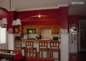
This barn red kitchen is cute and functional in its own right, but the family wanted something a bit more continuous with less separation between the kitchen and the dining area. They also wanted to give it an updated look and make it a more inviting space for the entire family to relax, eat, watch TV or work on homework. So, there were a number of goals to accomplish: update the cabinets, reconcile the boxy barrier without sacrificing the seating space and eliminating the columns.
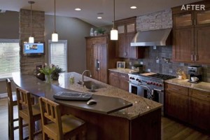
And here’s the dramatic after shot! As you can see, one of the pillars was effectively eliminated. The second one, unfortunately, was load bearing but the designer integrated it nicely into the remodeled theme. The TV is strategically placed, viewable both by the cook and anyone sitting at the island. The TV also serves as a kitchen computer with a wireless keyboard and mouse. The cramped dishwasher/kitchen sink/fridge and stove setup has been spread out, successfully opening up the work space. The kitchen sink and faucet have been moved to the island and all the appliances and hardware were updated to stainless steel. Polished granite countertops and chic lighting, plus a reconfigured layout, bring out a whole new sense of cohesiveness and style to this family kitchen.
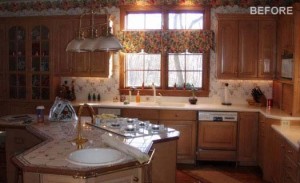
This odd triangular island took the concept of a “work triangle” too literally and instead wound up with a cluttered clover of kitchen sink, range and dining space. The gaudy, high arching brass faucet in the island is an attempt at elegance but seems a little bit irrelevant in this cozy, yet clunky kitchen. Something had to be done.
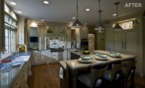
This new angled dining area with tiered workspace and high seating rectifies the wasted space the triangular island presented and retains the functionality that the original designer attempted. Looking at these two pictures, it’s hard to believe that it’s the same kitchen. It goes to show you how much bigger you can make your kitchen seem with a new layout.
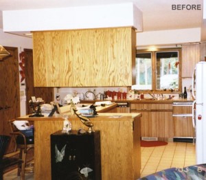
Notice anything problematic about this kitchen? This “sore thumb” cabinet design was probably a remnant of an earlier remodel that took out the walls and opened up the kitchen. At the time, it was likely a vast improvement. But now, it has a very disruptive effect-especially when you consider what it’s blocking: a gorgeous view of the river from the window by the kitchen sink. The beige palette also wasn’t doing this dreary space many favors.
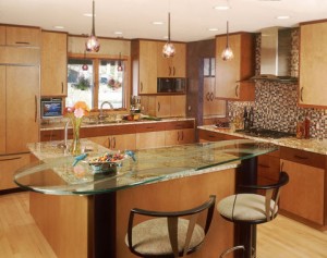
The next designer took the obvious first step of eliminating the unsightly cabinets, which helped to alleviate much of the claustrophobia in the room. A glass countertop, colorful mosaic backsplash and hanging kitchen lights add a bit of modernity without compromising the warmth of this kitchen space. The addition of the seating where the cabinets used to be provide more space for a prep sink on the island as well. And look-you can see out the window!
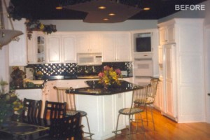
Another “once upon a time” kitchen that was undoubtedly stylish in its day. In the 21st century, the black, white and metallic tile basksplashes, over gloss and many angular elements (check out the island and piece above it) just aren’t going to fly. The cabinets are country-styled while the black countertops reach towards something a bit more cosmopolitan. The island,with its chairs dangerously close to the cabinets and counters, aren’t either working great here. A re-design helped this kitchen make up its mind.
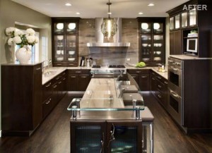
The bold contrast of colors is retained in this transformation, but the tasteful dark brown cabinetry and granite counter tops give it a more timeless feel. Stainless steel appliances and hardware help give more relevant sense of modernity as well. To alleviate the awkward clutter near the ceiling, the lighting has been simplified and the cabinets were extended with crown molding on the top. In the end, no storage space was sacrificed but much of the unnecessary busyness was remedied.
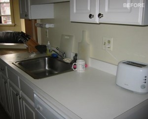
This was the best shot of the before kitchen they could get. Why? It’s cramped. Just behind the camera is a wall that makes the entire kitchen feel like it’s been built inside a subway car. It’s the typical city kitchen-unglamorous and highly conducive to takeout. The resident here is unsure of what to do with his cutting boards and appliances, so much of it remains on the counter, as if waiting to be put away. You get the sense that no one spends much time in this kitchen, and with good reason.
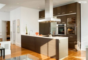
The designer made a smart move by tearing down the wall and opening up the kitchen to the rest of the condo. Now, the kitchen is ideal for entertaining. Cabinet storage towers to the ceiling and the sink has been moved to the opposite side along with a flat cook top for a tidy work triangle. The entire look and feel was given the appropriate urban chic, with modern pulls and a rich gray, oak cabinetry with a brown finish. The white CaeserStone quartz countertop is a stunning contrast and takes this entire space from bachelor pad to luxury gourmet.
Getting any good ideas? Great! Come on over to QualityBath.com and match your dream vision with our sales. You can copy the styles from these inspiring kitchens or you can follow your own creativity. The possibilities are endless, but with class and taste, you can create a kitchen that fits your lifestyle and personality.
