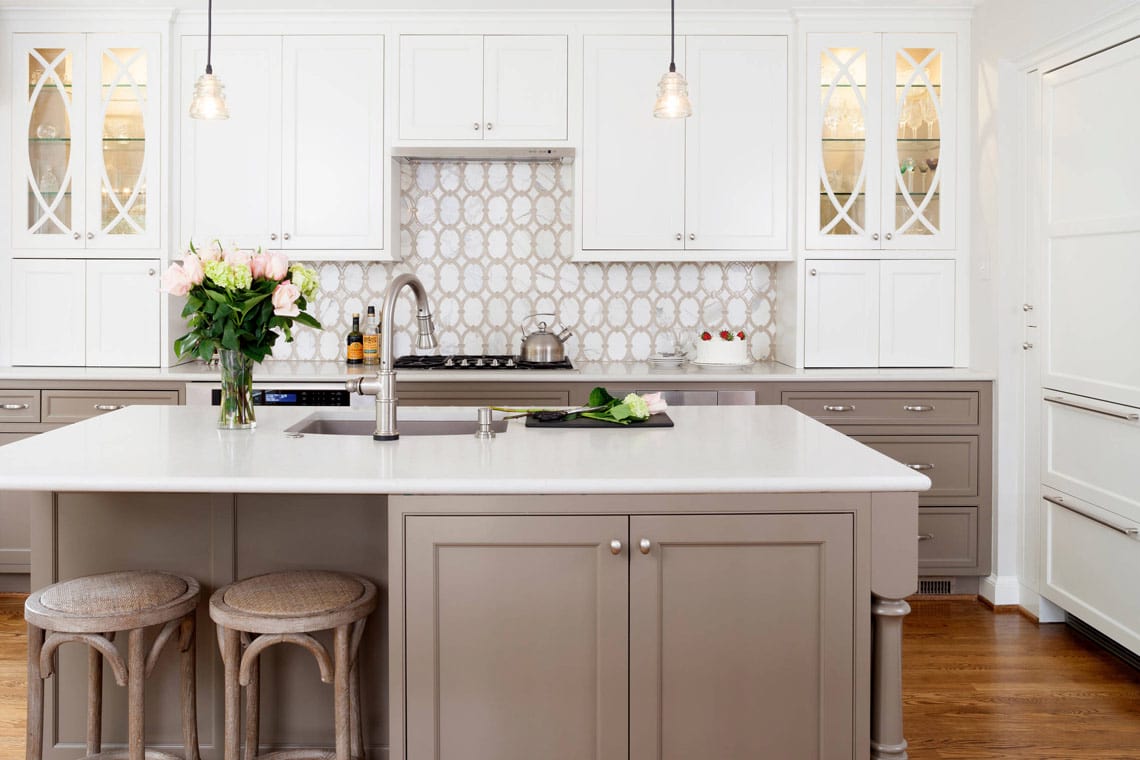
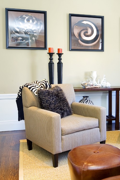
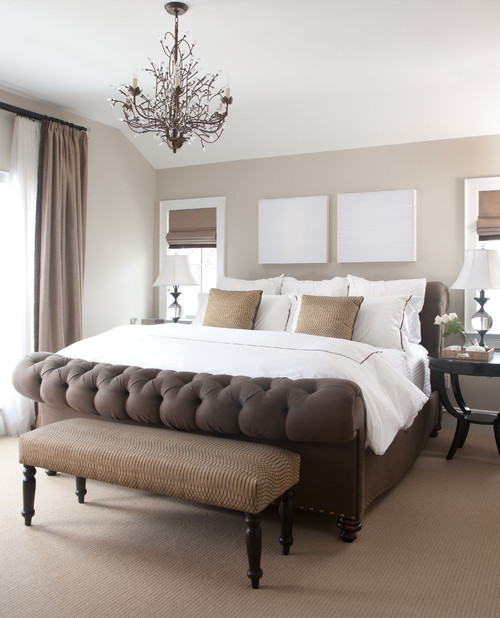
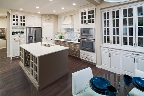
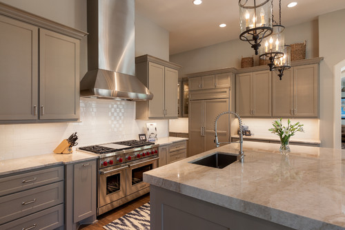
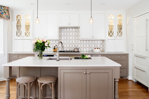
While “taupe” usually brings visions of drabness and dullness, in reality it’s a warm, earthy, sophisticated shade that just so happens to be stylish. It’s soft and subtle without being blah; related to gray but warmer and richer, combining the best features of gray and beige. Pantone’s top ten colors for spring includes Iced Coffee, a strong, stable “transitional color” in the taupe family that’s expected to “take us through the seasons.”
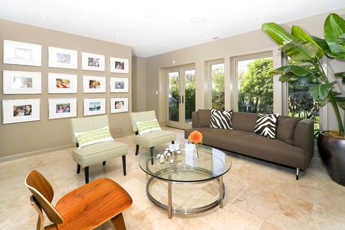
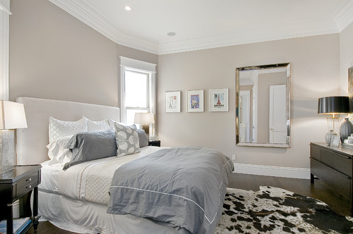
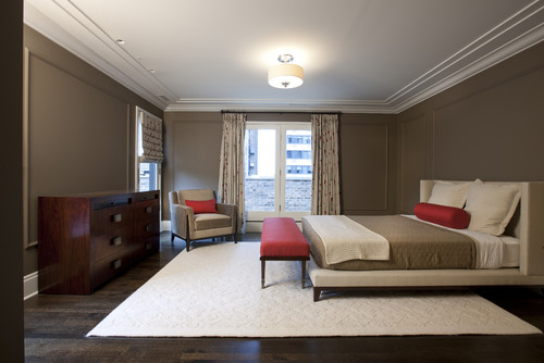
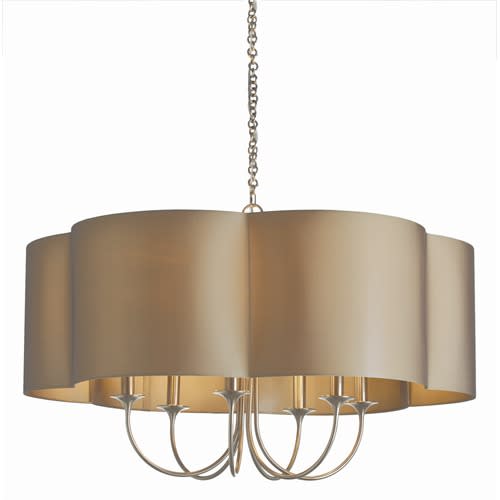
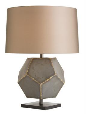
Taupe works with all palettes and styles, even stark pairings like black and white. While it’s considered a neutral, it quietly makes a fashionable statement on both large fundamental areas (like walls and floors) and smaller accents (such as lights, textiles, furniture, and other fixtures and accessories).
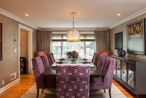
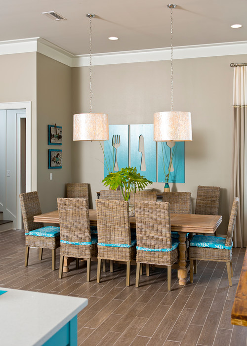
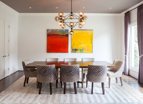
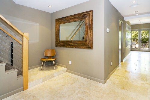
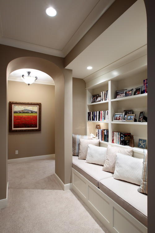
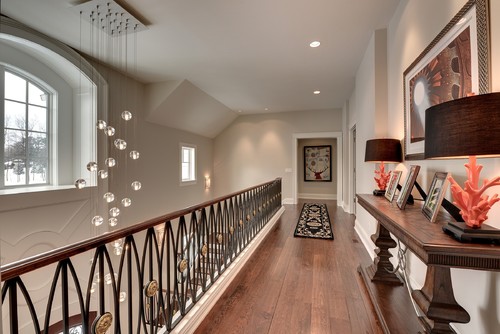
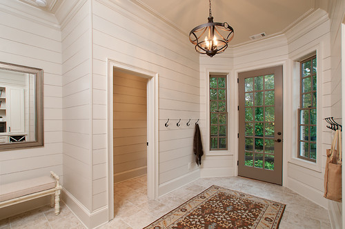
Not convinced? These homes showcase the awesome potential of taupe in every room of the house.
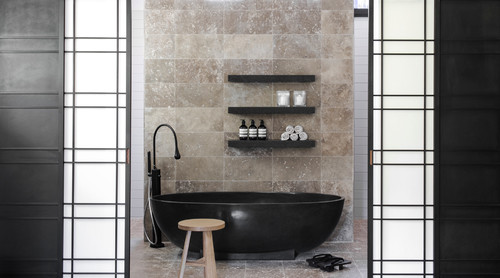
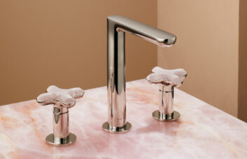
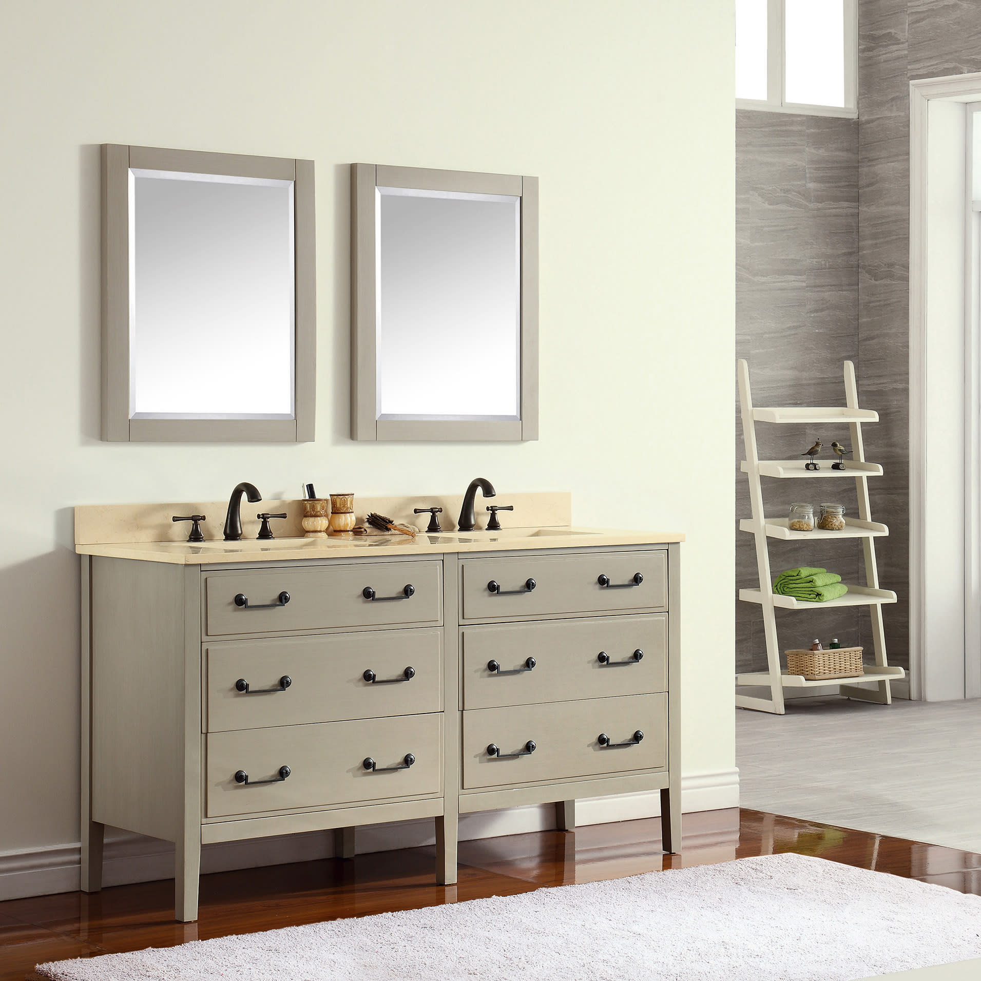
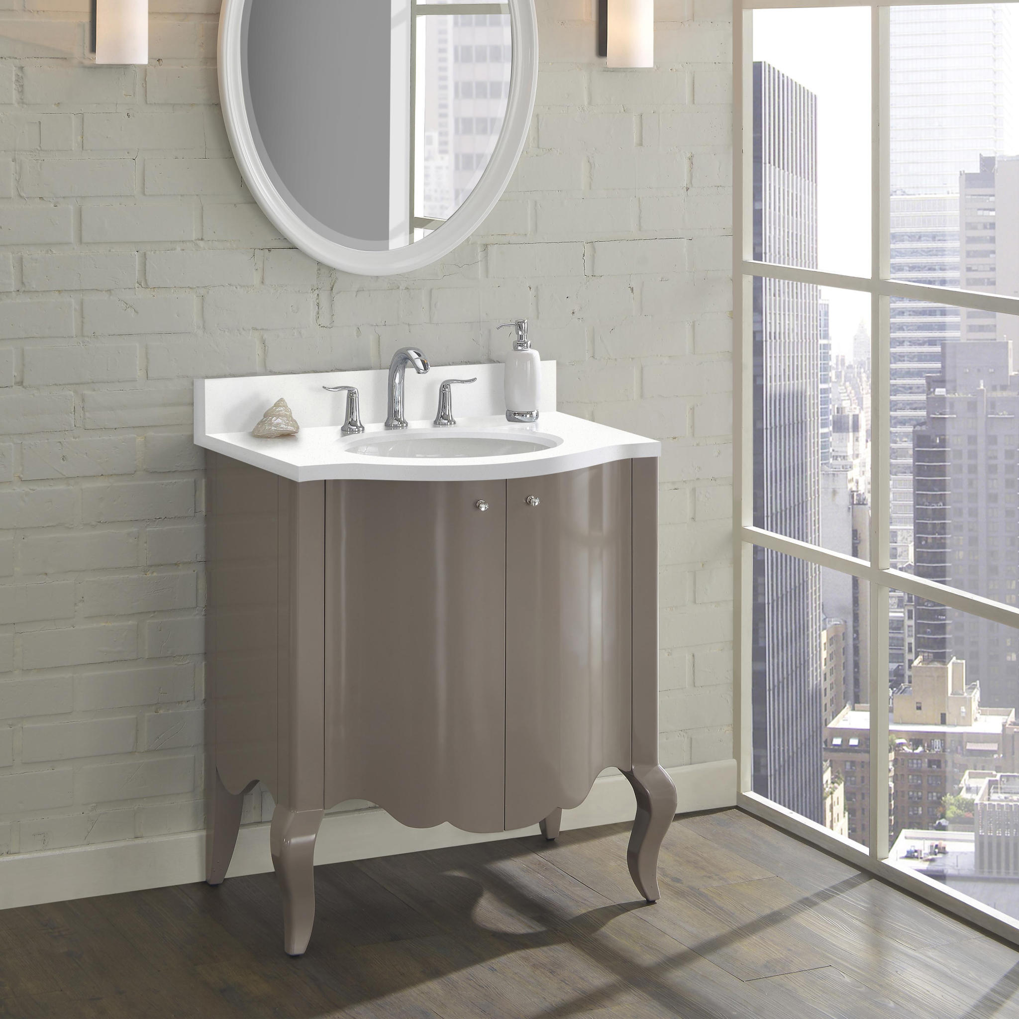
Taupe is tranquil in the bath:
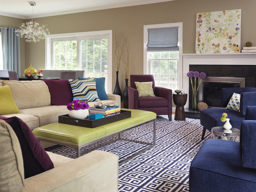
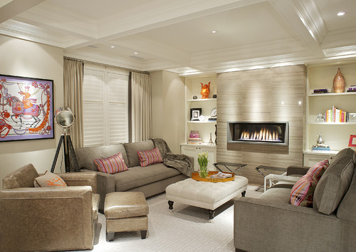
A cozy and welcoming living room:
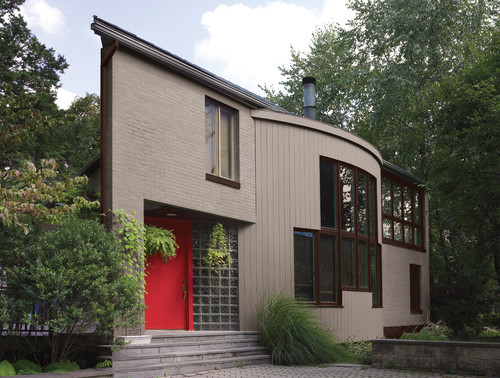
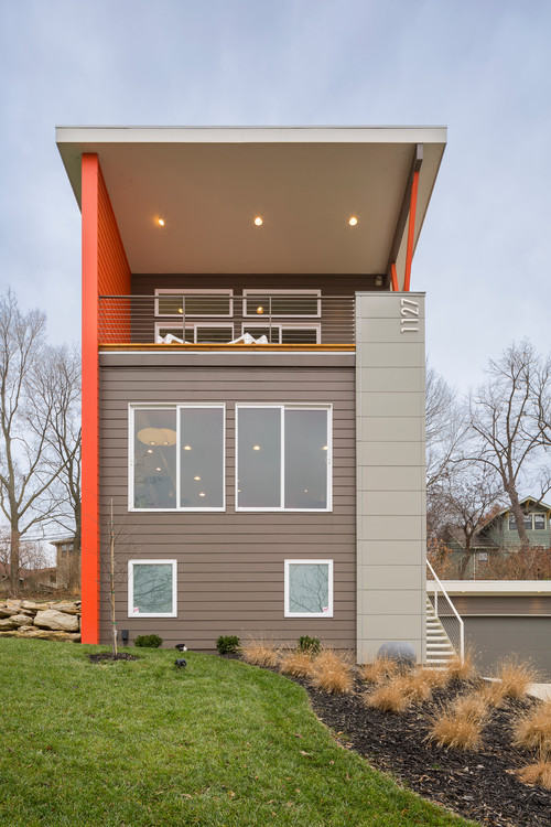
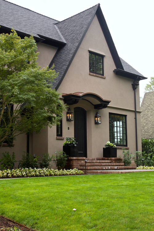
And ideal for exteriors, complementing – but not blending with – the surrounding landscape:

