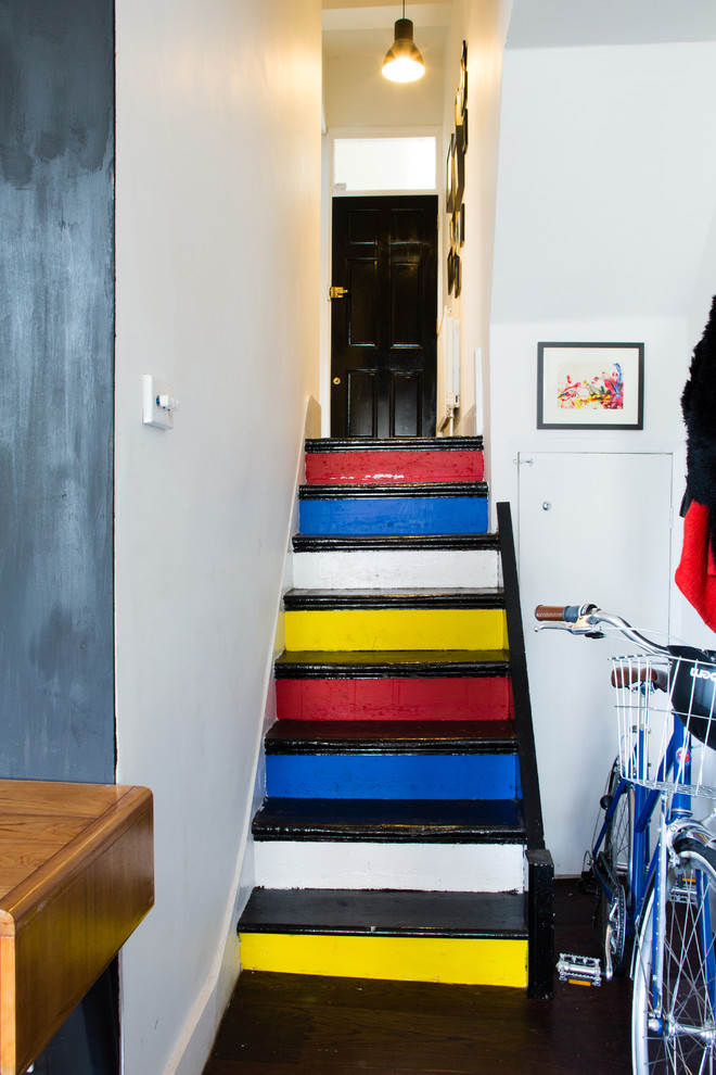
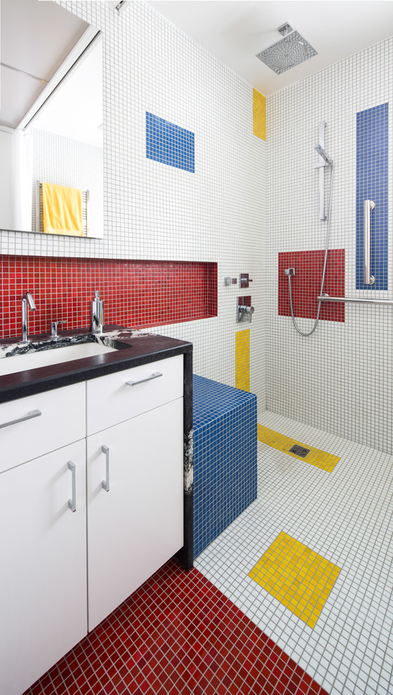
When it comes to color, sometimes it’s best to go back to basics. Decorating with primary colors – red, yellow, and blue – is as basic as it gets (besides black and white) – that’s why they’re called primary colors.
This classic combo is bold and bright, playful yet sophisticated. It works best undiluted (if mixed with anything else, the colors are, by definition, no longer primary) and proportionately represented (a red wall and yellow wall with a thin blue molding won’t cut it) for full effect and proper balance.
Because these colors are natural complements, you don’t have to fret over matching and coordination; they automatically look good with each other. For a primary color scheme to look its best, don’t bring in other colors – it’s better against a neutral backdrop like white, black, or gray.
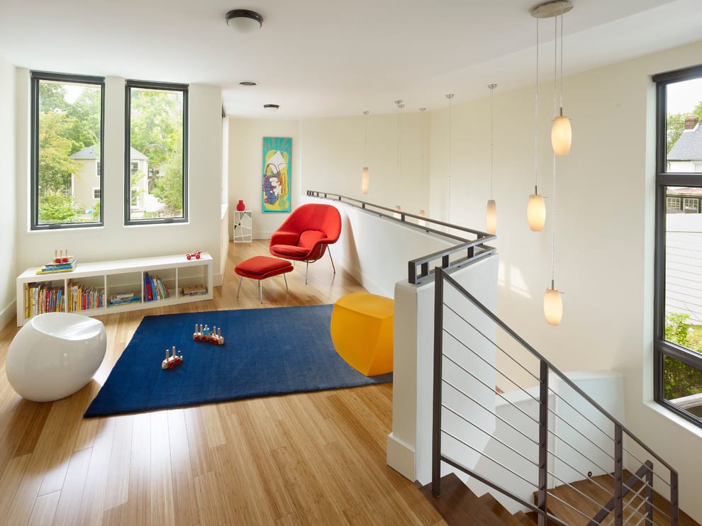
Primary colors are awesome in kids’ rooms (they’re gender-neutral for shared spaces and not “babyish” so they’ll grow with your child)…

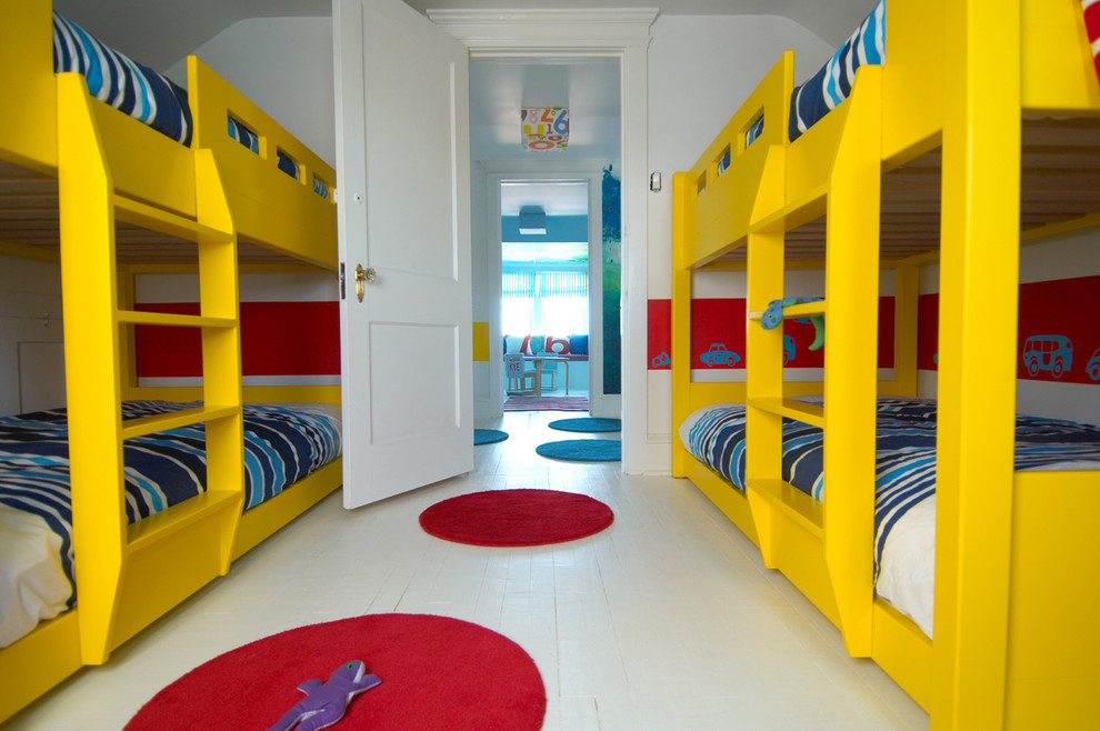
Photo via Houzz.com

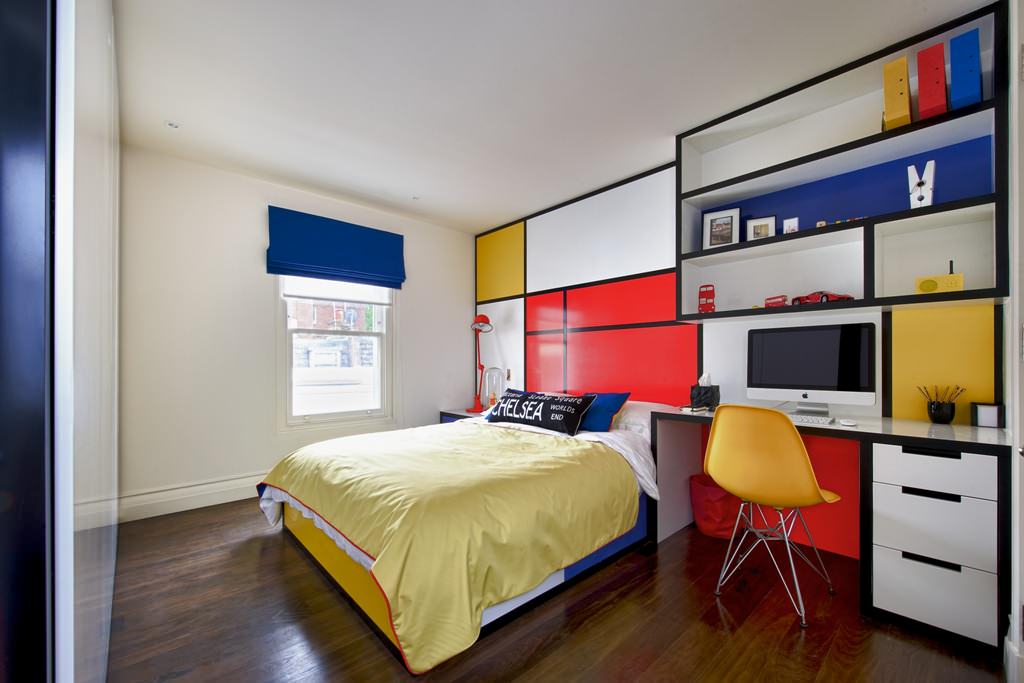
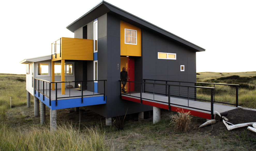
… and they’re equally awesome in grown-up rooms. This color scheme is young at heart without being childish, colorful and striking without overwhelming a space. Primary colors have an impact when used in any capacity, from large-scale exterior colors to tricolor light fixtures.

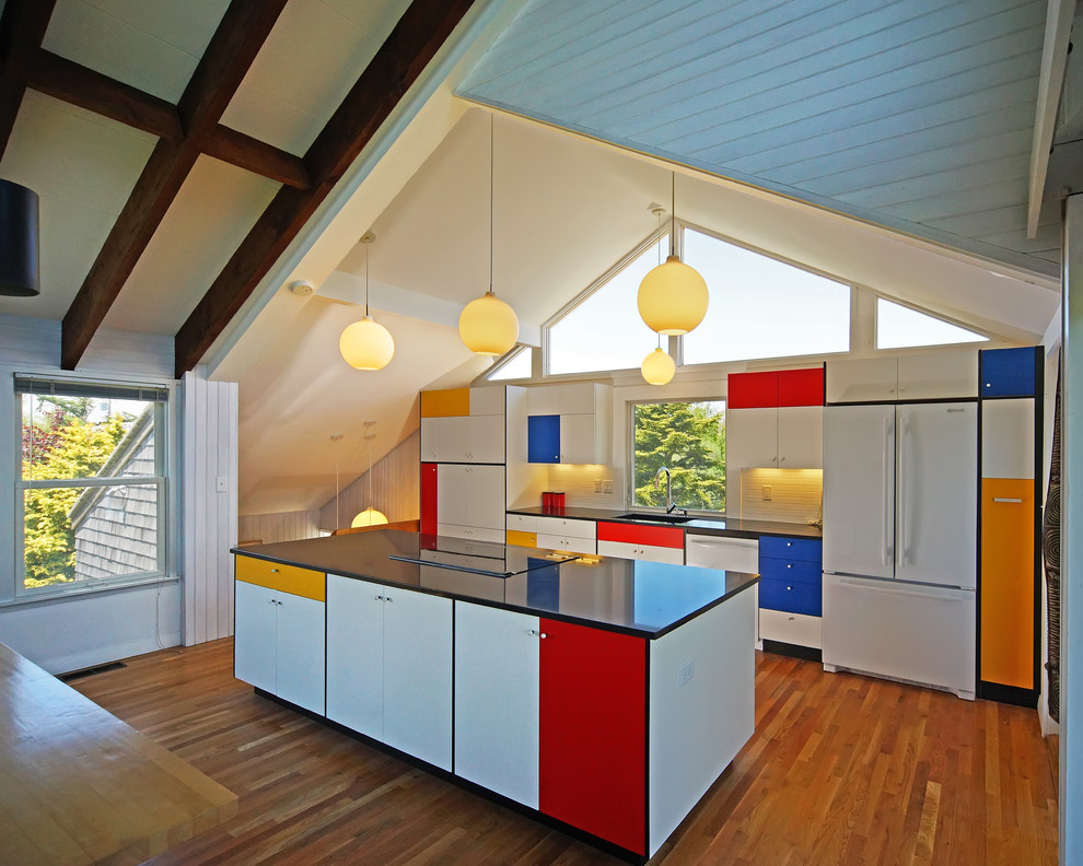
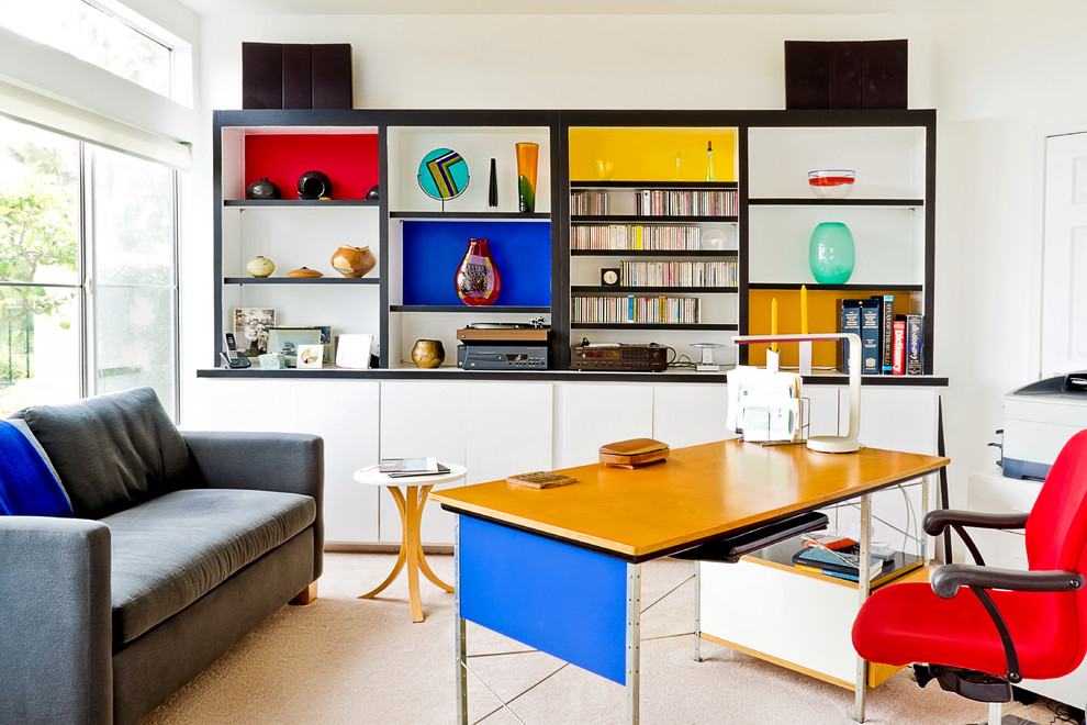
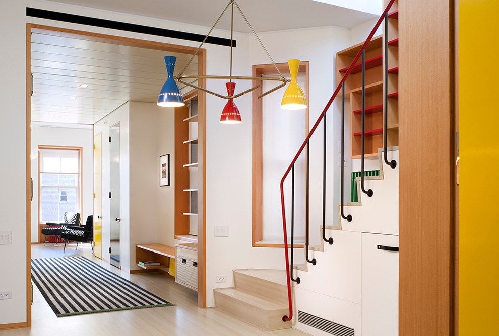
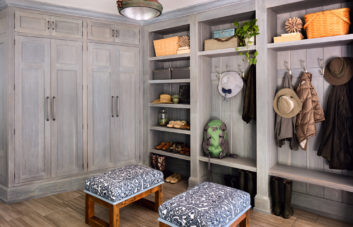
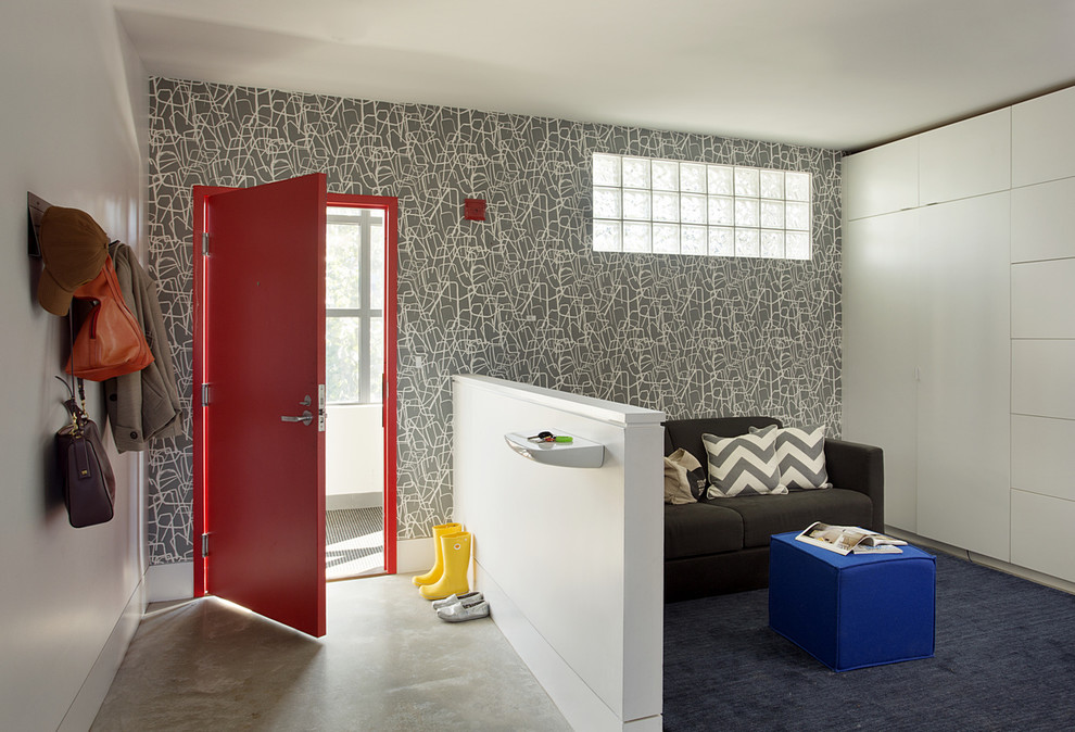
While balance is important, sometimes the smallest addition makes the biggest impact. In this room, for example, red is most represented (on the door), blue (on the ottoman) less than red, and yellow (the boots) least of all, but imagine it without that pop of yellow and you’ll recognize the ingenuity of adding color in different amounts. Just be sure to consider distribution when implementing this technique; with equal amounts of red and blue, the effect would be diluted.
What’s your home’s boldest color combo?