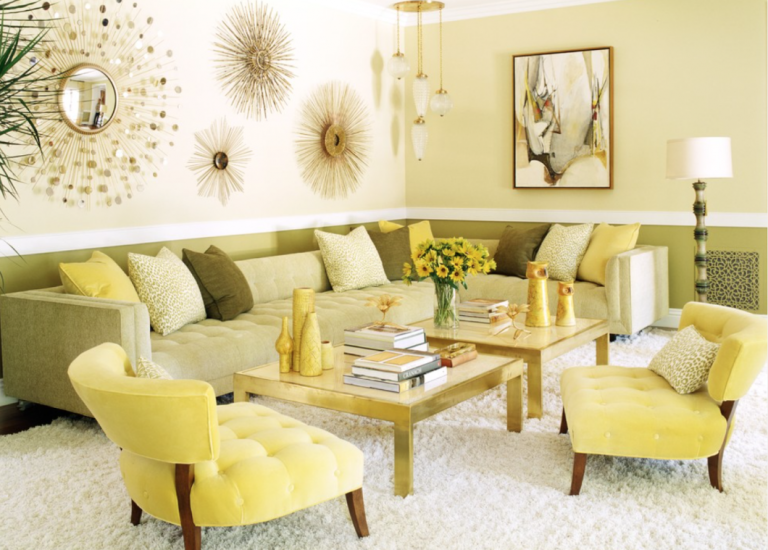
It’s summertime (well, almost) and we all know what that means: exchanging rich, deep colors for their bright and cheerful counterparts! This month’s color – buttercup yellow – is summery without going overboard, a softer, creamy pale yellow. Lacking the in-your-face brightness of other yellows, buttercup is sophisticated and easy on the eye, while still providing the sunniness and summer vibes of yellow.
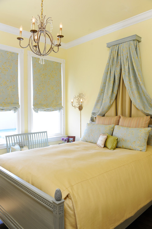
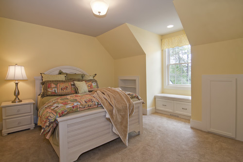
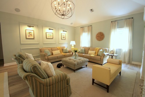
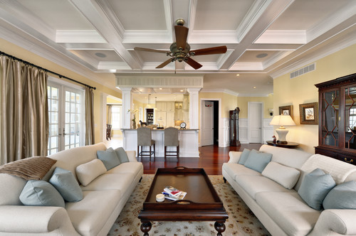
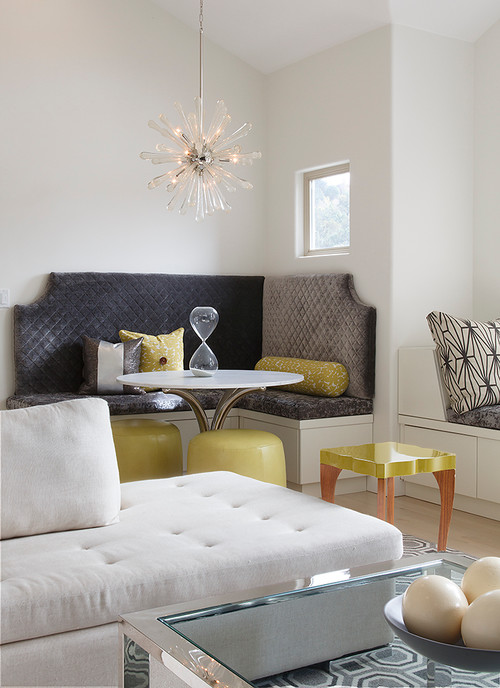
Buttercup is a fresh alternative to beige and complements most shades, especially blues and greens. It’s a beautifully soothing yet cheery color, making it the perfect choice for bedrooms and living areas:
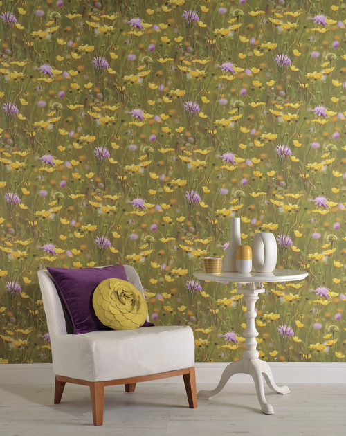
(How awesome is that buttercup print?)
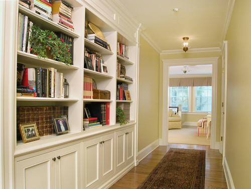
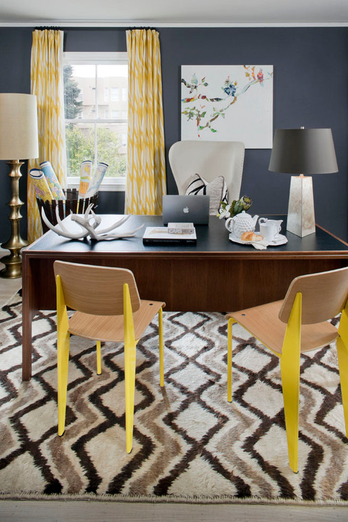
Try buttercup in your office to inspire productivity without the distraction of brighter yellows:
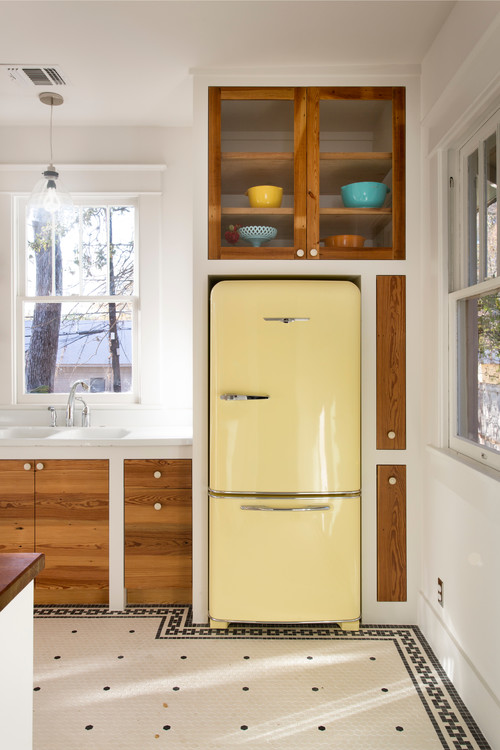
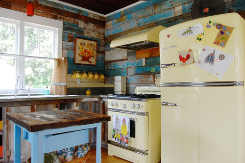
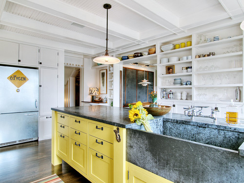
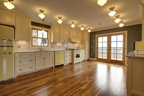
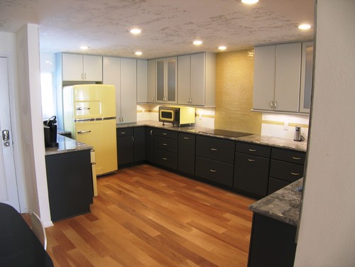
Yes, your kitchen can be yellow! Buttercup in the kitchen is typically retro, characterized – but not limited to – pale yellow appliances and/or buttery cabinets:
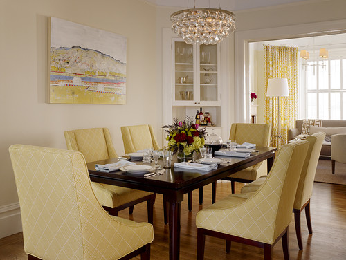
The warmth of this shade is inviting and comforting, an ideal combination for dining areas:
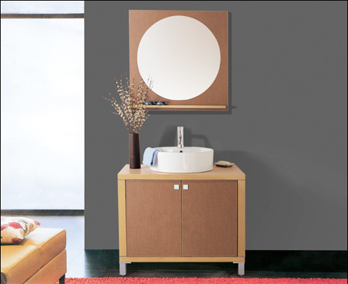
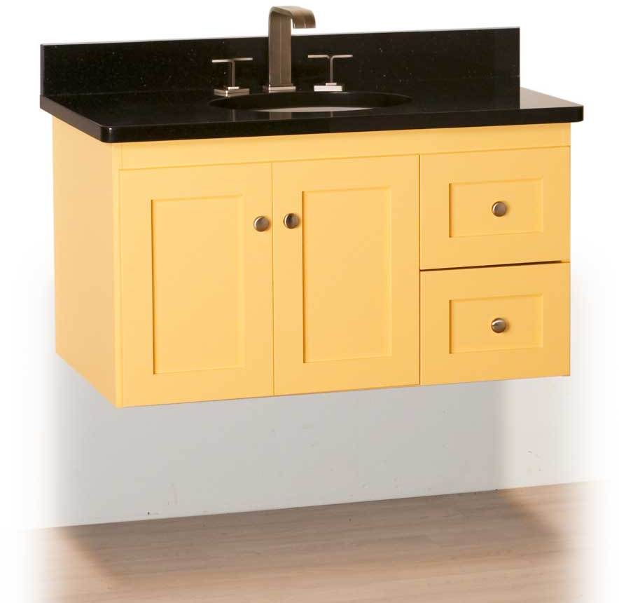
Wake up in the morning, crawl into your buttercup bathroom, and be energized without having to shade your eyes:
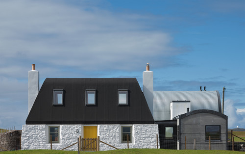
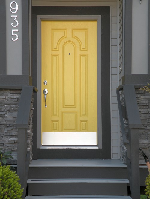
And perk up that exterior with a welcoming yellow door!

